


How to perform animation with CSS
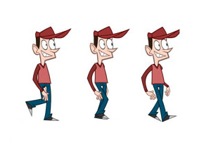
CSS-driven animation arose out of a need for front-end developers to be able to define this interaction without using JavaScript or possibly outdated Flash. Two main properties enable animation from CSS:
- transition
- animation
The “transitions” property is the simplest way to animate with CSS. A transition is used to soften the abrupt change in the value of a selected CSS property over a period of time by gradually changing the value of the CSS property.
The “animation” property is also based on changing the property of an element over time, but it allows a little better control and has additional other specifics.
Which properties to animate?
Not all CSS properties can be animated, but most can, a list of all properties that can be animated can be found here. Since animation can be a demanding process when it comes to resources, it is necessary to pay extra attention to the demand of animation. CSS animations are not automatically GPU accelerated, however, some browsers provide hardware acceleration of certain features to provide better rendering performance. Hardware acceleration (eng. Hardware acceleration) means that the “Graphics Processing Unit” (GPU) will help render the page by doing some of the more difficult tasks, instead of the “Central Processing Unit” (CPU). Therefore if resources are limited you should avoid features that do not support hardware acceleration. Today, the “transform” and “opacity” properties are in favor when it comes to animation, because the GPU helps them fade, so they should be used whenever possible:
- opacity
- transform: translate()
- transform: rotate()
- transform: scale()
Unlike the properties mentioned, the “set” includes all properties that change the geometry of the page (layout), because if you change one element, it is often necessary for the browser to recalculate the geometry of all other elements. Also, changing the color belongs to the group of “expensive” operations.
NOTE:
A new CSS property “will-change” has been introduced in order to improve resource utilization and optimize animations. The property “will-change” allows us to inform the browser in advance about what kind of changes we are likely to make, so that the browser can prepare in time and activate the appropriate optimizations before the animation itself. Read more about this property on MDN in the article “will-change”.
Differences between “transition” and “animation”
@keyframes
In the “transition” property, the animation is executed only on the basis of the initial and final values of a CSS property, while in the “animation” property, we have the possibility to define an unlimited number of intermediate values through @keyframe.
Start animation
Another important difference between the “animation” and “transitions” properties can be seen in the waythe animation starts. The “transition” property performs animation only as a reaction to the change of the CSS property that is being monitored (for example, when we change the value of a property by hovering over an element). While animations with the “animation” property do not require explicit activation (although of course such a way is also possible), they can automatically start playing immediately after loading.
Looping
The “transition” property can be triggered only once (for the same values), while on the other hand, the “animation” property can define how many times we want the same animation to be performed (including infinite).
Delayed launch
The “animation” property, unlike “transition”, can delay the start of the animation.
Interaction with JavaScript
When we want the so-called hybrid approach where the animation is primarily defined in CSS, but certain aspects of the animation are manipulated from within JavaScirpt, then it is always better to use the “transition” property. Using the “animation property with JavaScript is also possible, but modifying the @keyframes property from JavaScript is complicated.
Conclusion:
My approach to property selection boils down to the following dilemmas:
- If the animation is simple and without “looping”, then I use the “transitions” property.
- If the animation is complicated or has “looping”, then I use the “animations” property.
- If I want to manipulate property values using JavaScript, then I use the “transition” property.
BONUS: “transform” property
Transform property does not perform any animation, but is often used with the previously mentioned CSS properties that are responsible for animation (transition/animation). In fact, animations or transitions after changing the value of the “transform” property can be very interesting and impressive.
The “transform” property, depending on its value, allows the HTML element to:
-
translate along the axes
1234transform: translate(12px, 50%);transform: translateX(2em);transform: translateY(3in);transform: translate3d(x, y, z) -
we rotate
1234transform: rotateX(10deg);transform: rotateY(10deg);transform: rotateZ(10deg);transform: rotate3d(x, y, z); -
we scale by size
1234transform: scale(2, 0.5);transform: scaleX(2);transform: scaleY(0.5);transform: scale3d(sx, sy, sz) -
bevelled
123transform: skew(30deg, 20deg);transform: skewX(30deg);transform: skewY(1.07rad); -
add perspective
1transform: perspective(17px);A transform property with a value defined like this (“perspective”) does not affect the element itself, but affects the 3D transformations of the descendants, thus giving them depth perspective.
NOTE:
It is allowed to combine multiple values within one transform property, for example
|
1 |
transform: translateX(10px) rotate(10deg) translateY(5px); |
To combine several properties into one common property, we can also use the “matrix” property. This property is not written by the developer but is generated by additional applications. See the online matrix generator site “https://meyerweb.com/eric/tools/matrix, where the application accepts as user input a combination of “regular” individual properties, and returns matrix property values.
Example
|
1 |
rotate(45deg) translate(24px, 25px) |
goes to:
|
1 |
matrix(0.707107, 0.707107, -0.707107, 0.707107, -0.707107, 34.6482) |
Example
See the Pen Css3 Transform by Web programming (@chos) on CodePen.